‘The future is inclusive and accessible’ – says one of the taglines of the Adobe Spectrum 2 – the Adobe design system update set to be launched this year which claims to make the overall Adobe UI more accessible and adaptable.
Over the last few years, there has been a shift of how the brands are interpretating inclusion and diversity. While most of the brands are just jumping on the bandwagon (wait for 8th March and see all your social media timelines turning into pinks, full of flowers and butterflies), there are many brands that have moved beyond the tokenism and have come up with experiences, ads and campaigns pulling all the right strings.
I decided to list a few that I personally found inspiring:
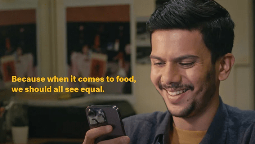
McDonalds India – EatQual 2.0: The app feature that actually made me write this post!
As per a recent report, around 70 million people in India have Color Vision Deficiency (CVD), also known as color blindness. To ensure that they can enjoy the same ordering experience as everyone else, McDonald’s India (West and South) launched a first-of-its-kind feature on its McDelivery App and website to make ordering more accessible and enjoyable. This innovative initiative, known as EatQual 2.0, builds upon McDonald’s India’s (W&S) inclusivity platform and was launched on World Sight Day last year. To promote the same, McDonalds launched a beautiful ad film that you can watch here.

Decathlon’s Ability Signs initiative: Merely changing the verbiage from ‘disable’ to ‘differently abled’ won’t do – that’s where Decathlon decided to use sports to change how we look at people who are differently abled. Under this initiative, Decathlon used its existing signage system to create 25 custom symbols that they later placed in a lot of their stores and stores’ parking. PwD representation deserves much more than the wheelchair icon – the icons created by Decathlon represented a variety of wheelchair and non-wheelchair-based para-sports, such as tennis, volleyball, hockey and archery. A brilliant example of how the slight change in iconography could change the entire narration – showcasing what differently abled people can do instead of focusing on the limitations.

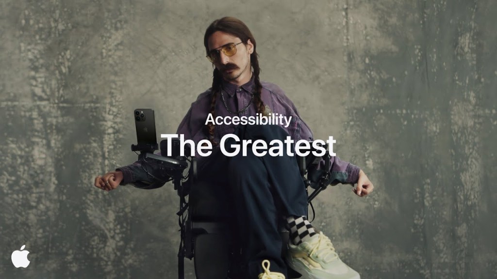
The greatest – Apple: Apple has been one of the front runners in the tech space when it comes to accessibility. In the short film ‘The greatest’, Apple showcased various accessibility features built across its products to make life easier for people who are differently abled. While the features are of course amazing and sort of life-changing, what I loved about the ad is that the ad captured daily lives of 7 individuals instead of actors for a truthful depiction and how the brand changed their routine activities – extending brand’s commitment to representation behind the camera, ensuring that the film captured the spirit of the community it aimed to empower. Link here.

Pure as love – Bhima jewelry: I saw this ad by the local jewelers, based out of Kerala, India, long back and somehow couldn’t get it out my head. In a country where fair is still lovely, it was unusual to see a jewelry ad without pretty women in the lead. The ad showed the journey of a transwoman and was an instant hit online. Well, representation matters! See the ad here.

Coca cola – I’d like to buy the world a Coke: The list can not be complete without the special mention of the iconic ad by coca cola that was released in 1971 – much before the I&D discussions became mainstream. The ad that most of us remember from the finale of the drama series Mad Men, covered people from all over the world in the ad and came to be known as the ‘The First United Chorus of the World’.

Brands have started to understand that inclusion isn’t a choice anymore, it’s a necessity. The consumer needs representation, to feel like a part of the brand and its story. As creators, it’s our responsibility to continue to develop more understanding around inclusivity, to move beyond the checkboxes of stereotypical imagery, signs and illustrations (restricting old people for only retirement related ads and communications, only men and women representation when it comes to gender sensitization etc.) and a continuous focus on creating something that could be experienced by a broader audience, something a viewer can relate to and feels a sense of belonging.
And for god’s sake, let’s think beyond flowers and butterflies for women!


