
A personal green and red light for the creative trends.
The beginning of the year is the perfect time to reflect on the previous year, learn from it and plan the way ahead. Hence, before I get back to work, I decided to put together a list of creative trends that I would love to see more (sort of a wish-list) and would try to inculcate in my designs along with the ones that could totally be avoided.
The green lighted trends:
Inclusive and accessible design: A conscious effort to make our designs more inclusive and accessible – ranging from representation of cultures and communities in our choice of imagery and graphics/illustrations to ensuring that the creative/design is experienced adequately by everyone irrespective of their abilities. An inclusive design is responsible design and shall be at the core of everything we create. Also, being the trend-setter in the industry, I hope Adobe finally launches Spectrum 2.0 – its inclusive and accessible design system – to lead the way.
Hyper-personalization using AI: No one wants be one of many! 2024 was all about AI, however, it all felt like all superfluous talk with nothing solid. With an exception of Cadbury’s #NotJustACadburyAd campaign a few years back, we have seen nothing extraordinary coming out of Gen AI. Hyper-personalization is one of the key features of Gen AI that has somehow taken the backseat amidst all pomp and show. Personally, I hope to see more on the creator side of Gen AI than efficiency – how to create material that connects on individual level and feels more personal to the viewer despite being for a large audience.
Emotional Design: When was the last time you saw a creative/design on any medium that triggered some emotion in you? Hard to remember, right? We are currently too focused on mass content creation that we are losing the touch from a basic reality that we are designing for humans and humans work on emotions – something that shall be the core of any creation. Any design that evokes any sort of emotion has higher recall value than an ordinary/generic design, after all, in words of Maya Angelou – people never forget how you made them feel😊.
Medium integration: Traditional softwares have seen a massive upgrade over the last couple of years making it easier for the creators to work across styles and mediums. Advanced 3D options in Illustrator, Adobe’s Project Neo (currently Beta), Text to 3D (Beta) feature on Substance 3D, Adobe’s easy to use premiere Rush, Adobe Express for quick videos, AI features in Figma – leaving no excuse for the designer for not experimenting across mediums. If done right, this ease of experimentation and integration would not only be great for satisfying the creative curiosity but also pushing the boundaries by creating unique products and designs.
Talking purely about aesthetics:
Textures: Last couple of years saw emergence of textures in creatives. My personal favorite has been the grainy texture and something I frequently played around with last year. Textures not only add to the overall drama of the creative but also are really playful and versatile. Excited to see what more the creators across the industry do with textures this year.
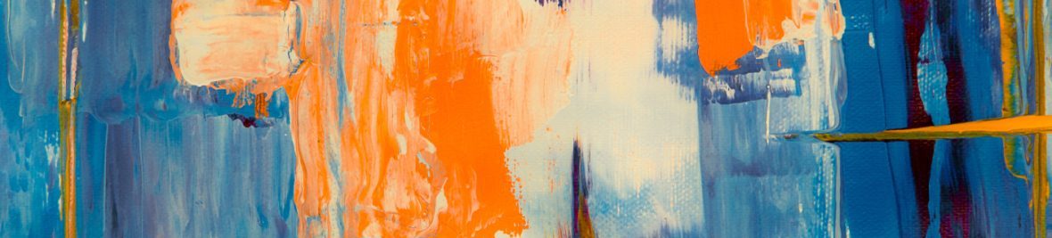
High color contrasts: I have always been a conservative when it comes to making bold choices about colors. However, over the last year, my perspective changed. From events like Birmingham Design Festival 2024 and Adobe Max Conference to Champions Trophy 2025 advertisement, the vibrant splash has been all over the creatives. During COVID, when the entire world went digital, the focus immediately went to the earthy or muted colours. The idea was to make digital designs easy on the eyes and less tiring to look at. However, after the world started to open, the colour trends in the creative industry saw a 180-degree shift with the movement to high contrasting solid and bright colours. Apart from the aesthetic, high contrasting colours are better for accessibility, especially for people with colour vision deficiency.
Metaphors: Symbolism raises curiosity. As someone who always loved symbolism and metaphors, I found myself focused more on straightforward designs. While direct designs are good for fast consumption, metaphorical concepts are the ones that break monotony, make the viewer pause and think. I personally find using geometrical shapes for symbolism really interesting and intriguing, giving the concept a playful yet professional look.
Red light: trends/design aspects that shall be parceled back to 2024:
Gen AI artwork that looks like Gen AI: Gen AI was exciting to use initially but reached its inflection point towards the end of the year. Instead of experimenting more with its true potential, designers leveraged Gen AI as a mere tool of enhanced productivity, leading to creation of similar sort of artificial imagery. I mean with around 8.09 billion people walking this earth, do we really need artificial, non-existent humans for our designs? It’s a powerful tool that shall be used to create that couldn’t have been created otherwise, not for lazy designs.
Staged imagery: This one goes against the Emotional Design. The fake smiles are easily caught and have very little or no impact on how your viewer would feel while experiencing the design – ultimately affecting the impact of the design. A big no until that’s the last option left.
Noisy designs: Heavy backgrounds, unnecessary text effects ruining the legibility, placing heavy content on solid or busy backgrounds, elements just to fill spaces that don’t add up to the message of the design and create confusion – all a big NO. Also, this shall not be confused with maximalist design – there is always a fine line between a maximalist and a whacky design.
Well, that was my take on creativity 2025! To create designs that sell, we need to understand the psychology of design. While creativity is a totally subjective thing, there are always ways to gauge the impact of what we create and parameters to keep in mind while creating.
What is it that you would like to see more or would totally avoid?
