

For a creative professional, nothing inspires a fresh perspective than travelling, deepening the understanding of cultural context in design.
Personally, whenever I want to break from my design style or get over a creative block, I always turn to my mood boards curated from my travels over the years. The latest addition to this mood board is the styles I picked from South Korea this spring. As someone who has more minimalistic style, with preference for real-time imagery and muted/pastel tones, I was surprised how I fell in love with South Korean way of designing – bold, vibrant, and so full of illustrations.
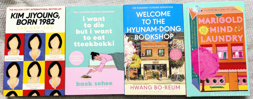
My first encounter with South Korean design style was through the Korean book covers – the illustrations so beautiful that would make anyone judge and buy the books by their covers.
And ofcourse, travelling to this amazing country was an experience like no other – an experience every creative professional must have atleast once. Considering my obsession with this country (that is showing no sign of dying down after all these months), I decided to do a little research on the elements of K-design that were consistent across the different cities. While the extremely digitally saturated environment and rapidly increasing global consumption of k-culture remain the key factors behind the way South Korea designs, there are a few underlying concepts that have influenced the Korean design style.
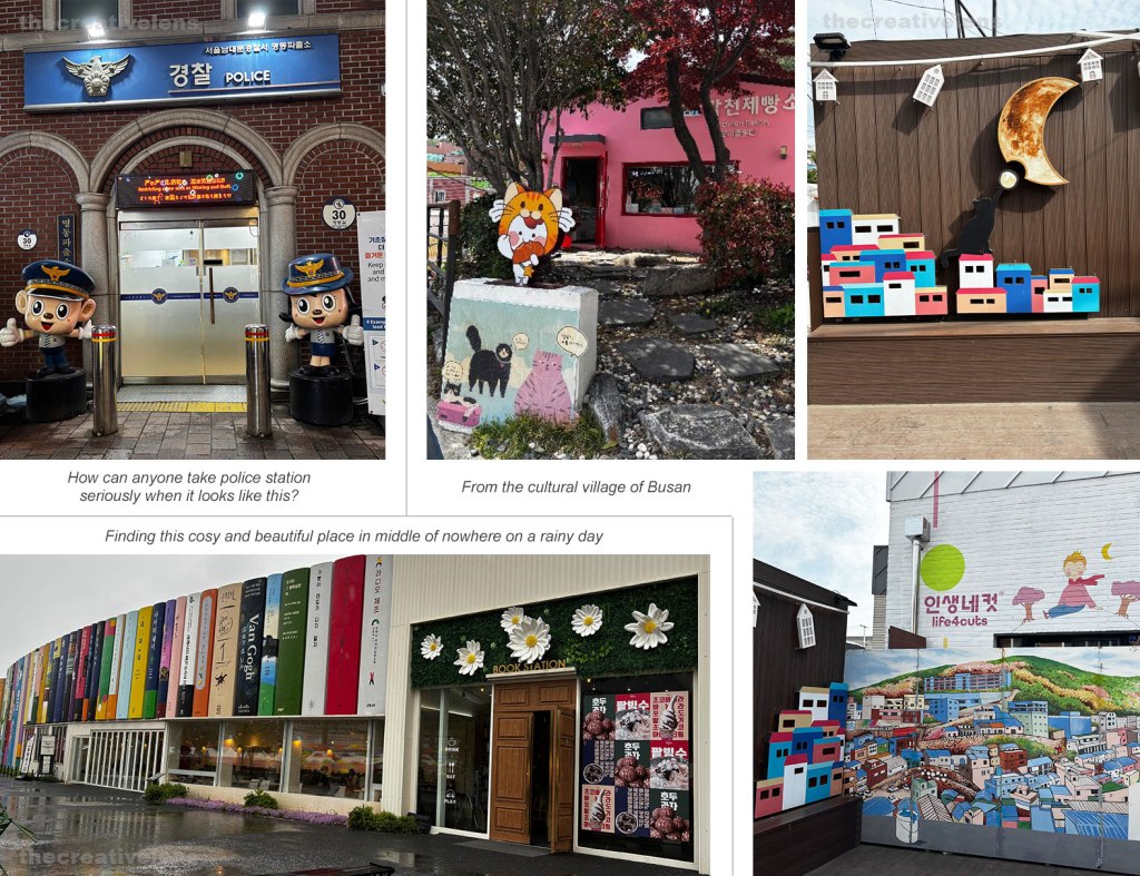
My first observation has been the excessive use of illustrations, especially the toons – from cabs to WIP sign boards on the construction sites, it is everywhere. Something that has been largely influenced by Webtoons. In the early 2000s, Webtoons emerged as a digital alternative to traditional ‘manhwa‘ (Korean comics), designed specifically for online consumption. Manhwa has been a significant part of Korean culture since 1908 capturing variety of character-based illustrative narratives. Webtoons took these narratives to the global scale, making the illustrative visuals an integral part of modern K-culture.

Korean color spectrum – bold and bright – another significant characteristic of Korean design. While the overall Korean design style is modern and global, the influence of Korean traditional folk art, especially for colors, is heavy on the contemporary design – making it a perfect interplay of cultures and timelines. Traditional Korean art, particularly folk paintings known as ‘minhwa,’ often features bold colors and stylized, flattened perspectives. The paintings, known for their focus on conveying emotions than the art technique, used the traditional colors of the ‘obangsaek’ (white, black, blue, yellow, and red) representing the five elements and directions. While these traditional meanings may not always be directly referenced in modern design, the historical precedent of using a vibrant and symbolic color palette has undoubtedly contributed towards bold chromatic expression. The bold colors aren’t limited to graphic design, even the structures like Busan’s Sky capsule with red, yellow, green, blue capsules carry the vibrancy of the palette. I mean the world today needs color, more than ever.
Similarly, the visual identity of K-pop – from their music videos, album art, to merchandise has been meticulously crafted to capture the attention of a global youth audience, while maintaining the Korean vibrancy.
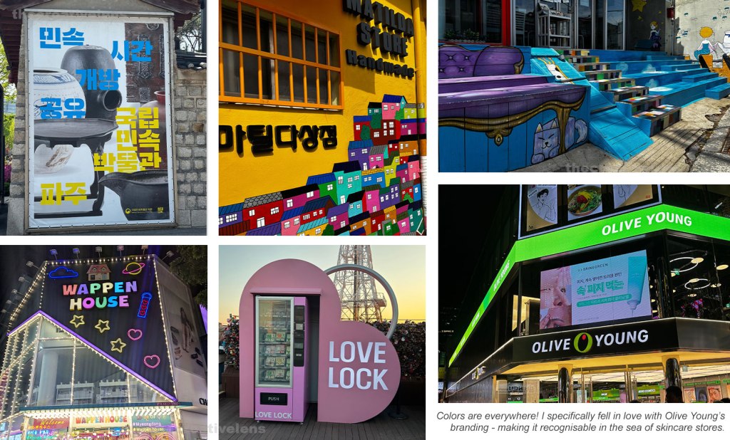
Lastly, it all boils down to the Korean concept of ‘aegyo’ – that literally translates to the quality of being cute – has made a surprisingly powerful impact on Korean graphic design. The overwhelming cuteness is felt across the country – whether in the branding, packaging material, installations or even the structures. Aegyo isn’t just a behaviour in South Korea, but a total visual mood. Making people go ‘aww’ is a very human way of establishing connect and making the audience/viewers feel good – managing that emotional connect in a highly digitalised society is no less feat.
I always felt that designs with real-time imagery are better at evoking emotions, but after visiting South Korea I realized how bold colors, illustrations and cute designs make one feel good and happy. From their designs to experiences, one could feel the people first approach (don’t even get me started on the LED lights embedded pavements at crosswalks). It made me feel how the design inspiration I was collecting from other countries might not be relevant in the coming years, whereas South Korea is already operating in 2050.
