

Gutenberg created the printing machine. But it wasn’t until 2014 that the attention was diverted towards the economic impact of fonts while printing, when a sixth grader in US proposed he could save the government over millions by switching to a different font. The claim was not, however, completely accurate, but it did get everyone talking. The logic is simple: some fonts need more ink and toner than others, impacting the overall cost of printing.
While the world has moved to digital, there is still no denying that print would never be dead.
Here is a list of a few ink-efficient fonts to make you save some penny (the innocent looking Arial could dig a hole in your pocket):
- Ryman Eco: Marketed as one of then world’s most eco-friendly fonts, Ryman Eco was created by UK stationary retailer Ryman and is claimed to use an average of 33% less ink than standard fonts.

- Century Gothic: Launched in 1991 by Monotype Imaging, Century Gothic is a geometric sans serif typeface, influenced highly by Futura. The computer department of the University of Wisconsin, Green Bay found that Century Gothic uses 30% less ink than the default font Arial and other common sans-serif typefaces.

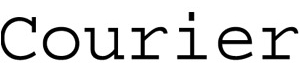
- Courier: A monospaced slab serif typeface designed by Howard ‘Bud’ Kettler, Courier was initially created for IBM’s typewriters, later was adapted for use as a computer font. The font was created from the sole purpose of ink efficiency in the era of typewriters. The font uses letters that are thin (but not small), which means less ink usage while printing.
- Garamond: Named after Claude Garamond – a punchcutter who cut types for the Parisian printer Robert Estienne in the early sixteenth century, the font has superior legibility and is widely used in books and literature (even the US version of our beloved Harry Potter series). The font has uses approximately 30% less ink than its almost look alike Times New Roman.

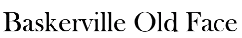
- Baskerville Old Face: This is a sweet looking font and yet highly readable , like something you’d find inside an old British library book. Seattle ink shop Inkfarm.com analyzed 134 fonts and found Baskerville Old Face used roughly 37% less ink and toner than Arial. Reading Baskerville Old Face is like a conversation with an old friend.
- Ecofont software: It’s hard to switch from our favorite fonts. If that’s the case, the Ecofont program would be the savior. Developed by SPRANQ in the Netherlands, this program punches holes in than regular fonts, which reduced the overall consumption of the ink needed for printing that particular font without impacting the overall structure of the font style.

The argument also put the typography on the sustainability bandwagon, with a school of thinkers calling out the environmental impact of the non-economical fonts. While there is no substantiated proof about the impact of fonts on the environment and the carbon footprint, the economic impact is clearly evident.
