

Pantone is here with its Color of the Year and the creative industry just can’t stop gushing over the beautiful color tone.
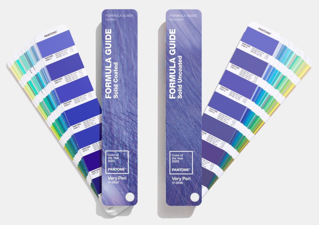
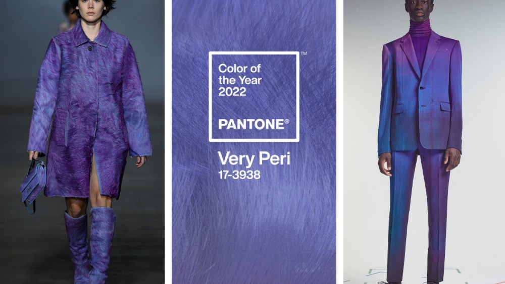
In the last two years, the world has been through a major restructuring both at personal and social level. This transformation inspired Pantone Color of the Year 2022 – PANTONE 17-3938 Very Peri. Unlike the previous colors of the year which were picked from the existing palette, Very Peri has specifically been created for the occasion (the first in the history of Pantone Color of the Year). Note: calling it purple or violet would be a sin!
According to Pantone, Very Peri ’encourages personal inventiveness and creativity’ and helps us ’embrace this altered landscape of possibilities’. With the expanding popularity of the digital space with the new age gaming, NFT and metaverse coming into the picture, the color depicts how the color trends in the digital space manifests in the real world and vice versa.
As we move into a world of unprecedented change, the selection of Pantone 17-338 Very Peri brings a novel perspective and vision of the trusted and beloved blue color family, encompassing the qualities of the blues, yet at the same time with its violet red undertone, PANTONE 17-3938 Very Peri displays a spritely joyous attitude and dynamic presence that encourages courageous creativity and imaginative expressions.”
– Leatrice Eiseman, Executive Director of the Pantone Color Institute
Very Peri color values: Pantone: PANTONE 17-3938 TPG; RGB: 102, 103, 171; HEX/HTML: #6667AB; CMYK (approximation): 40, 40, 0, 33
In case you have come across the term ’The Pantone Color of the year 2022’ and wondering about its inception and significance and how a color announcement is so newsworthy, here is a brief account:
Pantone Color of the Year
Pantone has been the king of influence in all aspects of color design and color trends since its origin in 1963. The introduction of the Pantone Color of the Year in the year 2000 confirmed the Pantone Color Institute as the front-runner for all things color-related globally.
The Pantone Color Institute studies color trends throughout the year and all the aspects of the society: fashion, marketing, social media, economic situation and even politics are taken into account while deciding the Color of the Year. The aim behind the colour of the year process is to influence the wider design world, from interiors, fashion, communication to industrial design.
You can check out an array of inspiring renditions and corresponding colors to Very Peri on Pantone’s Instagram handle.
*Originated in 1963, Pantone, patented as ’Pantone Matching System’ by Pantone LLC, is a standardized color reproduction system enabling consistent output across all the mediums globally. Pantone colors are described by their allocated number (for example, classic blue will be ’PANTONE 19-4052’).*
