

The AI image generators evolved tremendously over the last couple of years and have been great for surrealist art and hyper-realistic images and graphics, but ask them to build a cohesive, text-heavy infographic, and the results were metaphorically similar to those initial weirdly fingered hands.
Gemini Nano Banana tried to fix the text issue, but it has not been too accurate with detailing. Talking specially about infographic, its much more complicated than generating an image with some basic text. It requires massive refinement of information into easily communicable pieces.
After all the hype around ChatGPT’s Images 2.0 being better than even Gemini 3 Flash Image in the last 48 hours or so, I was keen on checking its accuracy with a text-heavy design and decided to test the two models with an infographic.
And honestly, my loyalty shifted!
I gave a simple prompt to both the models (free versions):
Create a visually rich infographic about Van Gogh’s paintings. Start by creating a timeline with a short intro and meaning behind every painting. Style it like a bold graphic illustration supported by the images of the paintings, call outs, and concise text elements. Use clean backgrounds with a touch of Van Gogh theme with strong graphic elements (shapes, icons, color blocking) in a layered composition. Make it dense, tactile and professionally authored.
The contrast was stark. Here is how ChatGPT’s Images 2.0 surpassed Gemini 3 Flash Image:
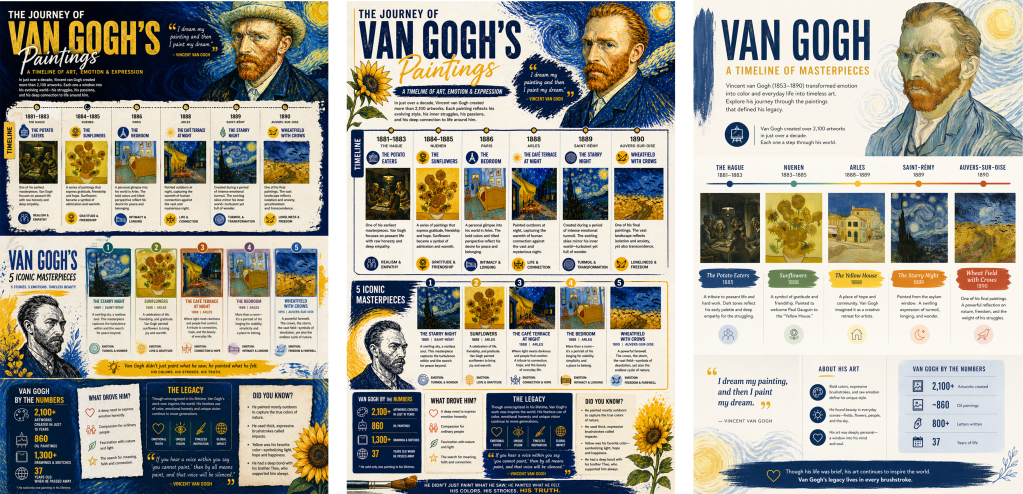
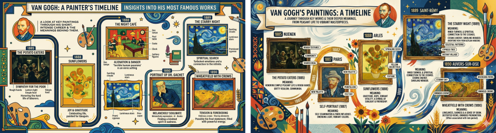
1. The information itself: While Gemini did exactly what it was told to do (with bad detailing of the paintings), ChatGPT intuitively added much more relevant information to the graphic – making it a well-rounded infographic on the artist’s work.
2. Structural sophistication and layout: Creating an infographic isn’t just about rendering a pretty picture; it is about organizing information logically. ChatGPT’s image generation exceled at spatially organizing timelines and information flow. It grasped how to segment information into readable blocks while Gemini clearly seemed to be struggling with the rigid, multi-layered structural demands of a professional infographic, resulting in a layout that felt a bit more chaotic or misaligned.
3. Information curation and typography: Historically, AI models have struggled with rendering legible typography, often producing ‘alien text’. More than just spelling words correctly, ChatGPT curated the information efficiently, knowing when to use a bold header, when to use bullet points, and how to balance the text-to-icon ratio so the graphic doesn’t look cluttered. Gemini’s output was noisy and cluttered.
4. Conceptual cohesion: In this particular instance, ChatGPT demonstrated a stronger grasp of cohesive design language. By contrast, Gemini lacked sophistication in design language with so much clashes of elements.
5. Additional tools: While both ChatGPT and Gemini have Adobe Express integrated for basic adjustments, Selection Tool available in ChatGPTis much more helpful when one wants to change particular text/element without getting the entire infographic generated again (which could be really painful). The other convenient feature is the image size option in ChatGPT (just like Adobe Firefly).
To summarise, Gemini is a powerful, highly capable tool for many creative tasks, especially quick visual ideation and image editing that will even give you the rationale behind the output. But when it comes to the specific, rigorous demands of information design, ChatGPT’s latest upgrade felt like a more superior choice. While the ChatGPT’s output is also not perfect with high-end design details, it is definitely impressive!
